Context
Gate Three is the internal construction management platform used for every construction project at EllisDon. It is comprised of multiple modules and used by different departments throughout the project lifecyle.
The traditional methods of using Excel, Word, and paper to collect project information meant missed opportunities for the business to aggregate and use data. The product team had already translated some of the most essential documents into a web format but there was a need to make this process more sustainable. Instead of the product team developing every piece of content, we wanted to put document management into the hands of users.
The users
The tool needed to handle real complexity (conditions, versioning, metadata) while feeling approachable to executives who had no interest in learning new software. Understanding who I was designing for was the first question I had to answer.
The users were split into two groups with different needs.
Content creators were executives responsible for managing documents specific to their business area. Efficiency was critical: these were busy people, not power users. They would receive training, which meant there was an opportunity to progressively introduce more advanced functionality while supporting the transition away from Excel and Word.
Content consumers were the people who would access the documents content creators built. While creators determined the structure, the building blocks of those documents and the experience around consuming them were within my design scope.
The business needed the tool to save development time and streamline data collection. The design needed to prioritise creation efficiency, make complex back-end functions visible in a simple way, and progressively introduce advanced features.
Creating a foundation
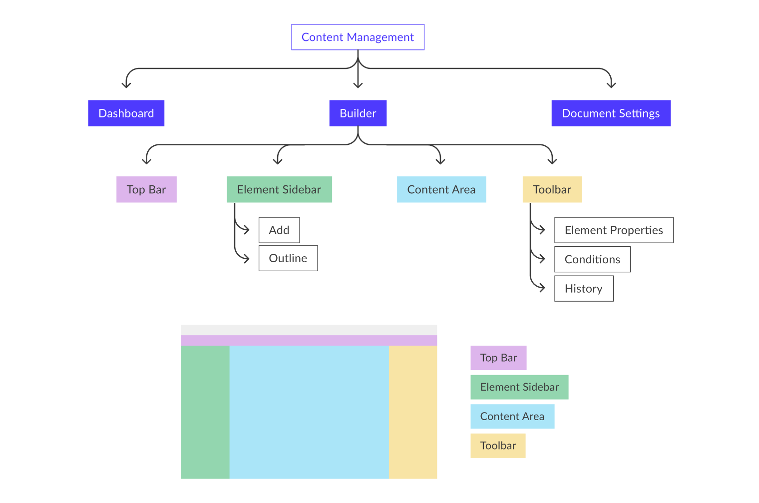
Mapping the big picture
Because of the scope of this project, I wanted to get a handle on the big picture before diving into detail. I assessed the requirements with the PM, broke them into functional areas, and mapped them onto the existing global elements: the sidebar and the toolbar. This created a framework for understanding each part of the product and its relationship to the whole before any screens were made.
Understanding the current state
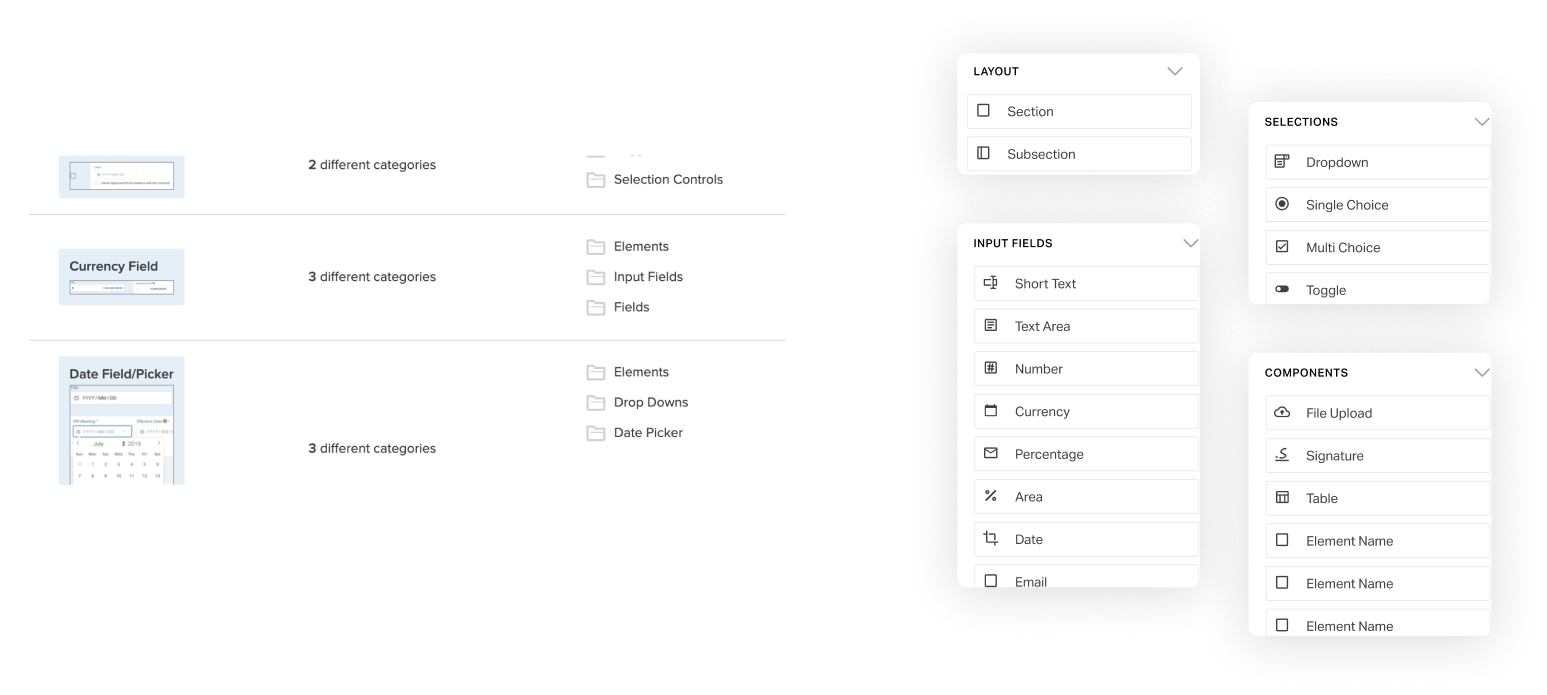
I explored documents across each business area to understand their form and function. This resulted in a complete list of every element being used: text fields, dropdowns, signature fields. I also noted how they behaved. For example, a dropdown answer that toggles the visibility of another field. Understanding the full range of functionality the product needed to handle was essential before any design decisions could be made.
Research
Card sorting
With the complete element list in hand, I created a card sorting activity in Optimal Workshop to test how users naturally group elements. I kept it open: users could create their own categories rather than sorting into predefined buckets. In combination with my understanding of the most frequently used elements, the results informed how elements were grouped and ordered on the sidebar, so creators could add them to documents as intuitively as possible.
Matching the mental model
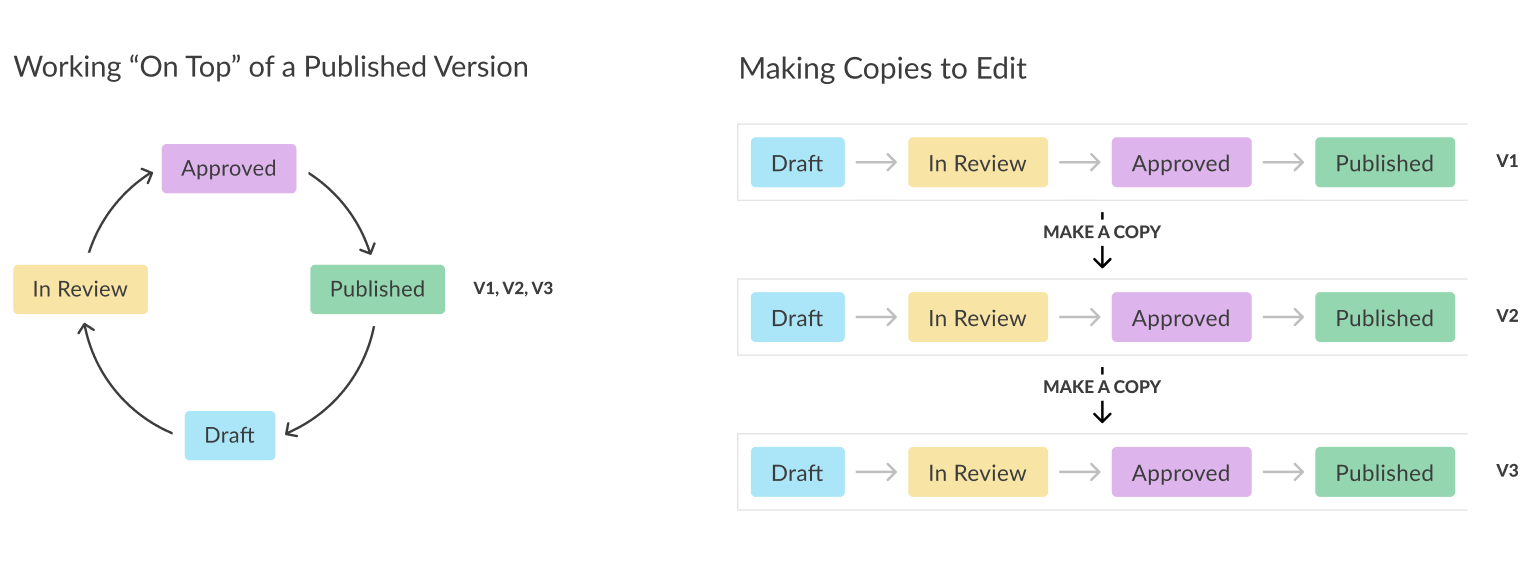
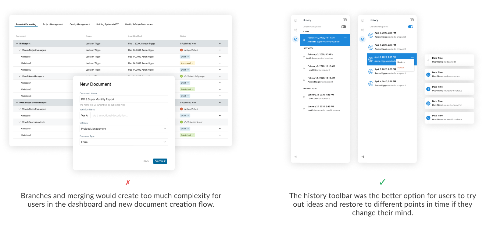
One of the harder questions was how users thought about document versioning. I came up with two possible models, each with implications for the dashboard, the content area, and the history toolbar. Getting this right mattered.
Based on my experience with other tools, I had a bias toward one option. After hearing from users, it was clear the "making copies to edit" model was the better choice. In practice, this changed very little in the back-end. But it changed everything in the interface. Matching the model to the way users already thought about the process meant they didn't have to learn a new mental model on top of a new tool.
Design highlights
Spreading out cognitive load
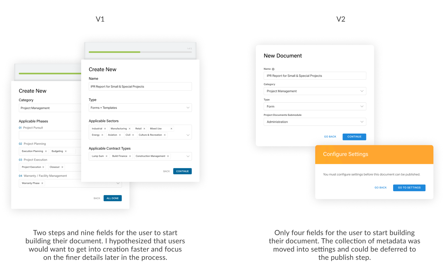
To create a new document template, the first step is completing a "Create New" modal. A document requires metadata to sit within the content ecosystem, and there was a request to collect all of it upfront in that first modal. I went through iterations trying to fit every piece in.
Stepping back to focus on the user, I realised it didn't make sense to front-load the process. I hypothesised that users would want to get into creation with as little friction as possible. I distilled the modal to just the essentials and convinced stakeholders that metadata could be collected at a later stage, once the user was already invested and ready to publish.
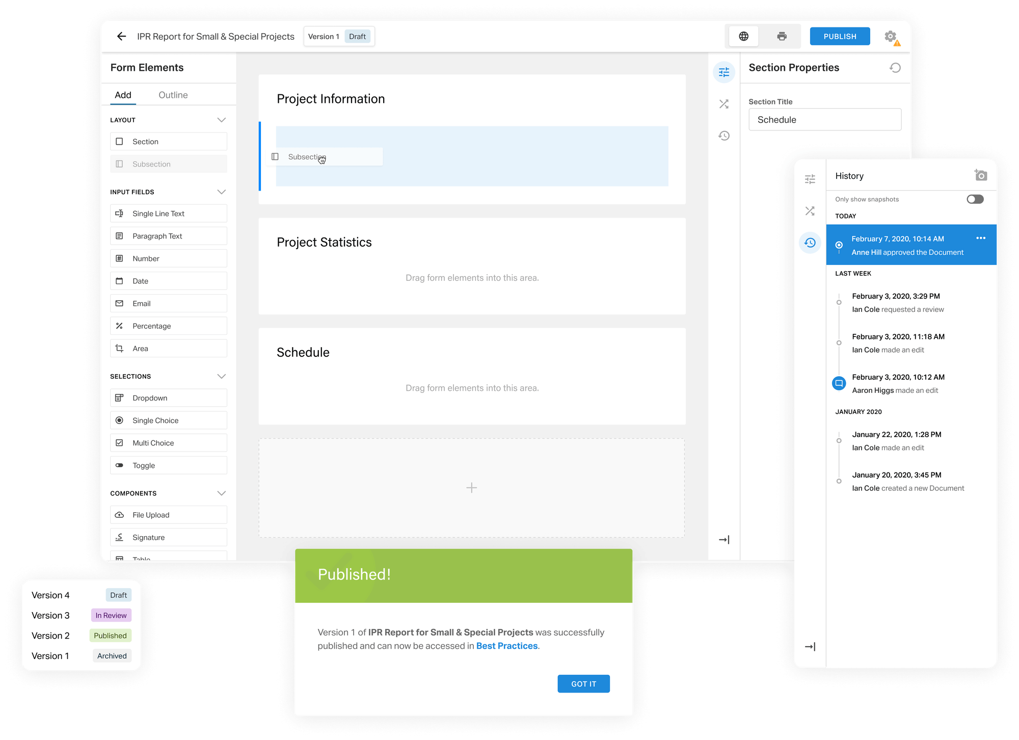
History tool
I also looked at how users could explore different ideas within versions. Initially I explored branching and merging, approaches used in other tools. Based on user feedback, those concepts added too much complexity.
Instead, I leveraged the history toolbar and took a cue from Photoshop by adding a snapshots function that let users travel between specific points in their editing process. To make the tool scalable across the platform, I standardised action types and time increments.
Using colour for context
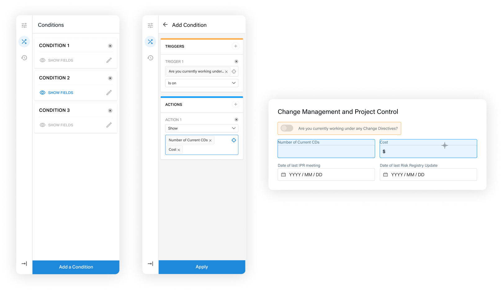
Designing form conditions (where a dropdown answer triggers the visibility of another field) meant making complex back-end logic visible in the interface. I considered adding conditions as a separate mode, similar to the settings page, because I worried the toolbar was too small for the complexity.
The more I thought about it, the clearer it became that users would need the context of the content area to visualise the connections between elements. I created visual cues through colour to distinguish triggers from actions, and used targeted selection in the content area rather than dropdowns, reducing cognitive load while keeping users in context.
The result
Focusing on efficiency and simplifying complexity, the Content Builder gives content creators a tool to build and manage documents independently. They can add complex conditions, navigate version history, and iterate on documents without any development support.
The solution makes document management sustainable and ensures data is collected in one place, usable across the business.